Download the Lessonotes Mobile Liberia app for faster lesson access on Android and iPhone.
Subject: Mathematics
Semester: 2
Period: 6
Week: 35
School Name:
Teacher’s Name:
Subject: Mathematics
Grade Level: Grade 4
Date: Week 35
Lesson Duration: 45 minutes
Week & Period: Week 35, Period 6
Topic: Data Handling
Sub-topic: Graphs and Statistics
Learning Objectives
By the end of the lesson, students should be able to:
- Collect and display data in graphs.
- Read and interpret bar graphs, line graphs, and pie charts.
- Calculate mode, median, and mean from a data set.
Previous Knowledge
Students already know how to count and organize simple information in tables.
Instructional Materials
Mathematics textbook for Grade 4, graph sheets, rulers, markers, chalkboard.
Lesson Development – ABC Model
A – Anticipation (Warm-up / Starter)
Time: 5–10 minutes
Teacher asks: “How many brothers and sisters do you have? Let us make a chart of family sizes.”
B – Building Knowledge (Main Lesson Body)
Time: 25–30 minutes
🧠 Full Definitions
- Data
A set of facts collected for reference or analysis. Data can be numbers (quantitative) or categories/labels (qualitative). - Graph Types
- Bar Graph: A graph that uses rectangular bars (vertical or horizontal) to show quantities for different categories. The length (or height) of each bar corresponds to the quantity (frequency) of each category.
- Line Graph: A graph that uses points connected by lines to show how something changes over time or a sequence (e.g., rainfall per month, temperature changes).
- Pie Chart: A circular chart divided into slices (“sectors”) where each slice represents a proportion or percentage of the whole. Useful for showing parts of a whole.
- Statistics / Measures of Central Tendency
These are ways to summarise a set of numerical data by a single representative value.- Mode – The value(s) that appears most often in the data set. There can be more than one mode (bimodal, multimodal), or none if all values occur only once.
- Median – The middle value when the data are arranged in order (ascending or descending). If there is an odd number of values, the median is the central one. If even number of values, it's the average of the two middle values.
- Mean (Average) – The sum of all values divided by the number of values. Sometimes written as x̄ (“x‑bar”).
- Why These Matter
- Graphs help visualise and interpret data more easily than raw numbers.
- Mode, median, and mean give different perspectives (“what is typical?”) of a data set. Sometimes one is more useful than the others (e.g., median is more resistant to very high or very low values which might skew the mean).
Examples & Fully Labelled Diagrams
Here are expanded examples, with sample data sets and diagrams.
Example 1: Bar Graph
Data: Favourite Fruit in Class (20 students)
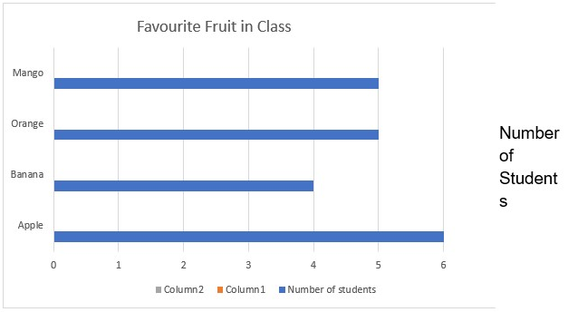
- Mode of this data: Apple (6 students love apples)
- Median= arrange either in ascending or descending order and then select the middle number. If it is 2 numbers, add both numbers and divide by 2: 6, 5, 5, 4= 2 middle numbers = 5+5 = 10/2 = 5
- Mean: add up all the numbers and divide by the amount of the numbers= 6 + 5 + 5 + 4 = 20/4 = 5
Example 2: Line Graph
Data: Rainfall over Four Months
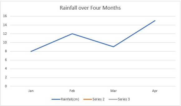
Shows increasing trend from Jan → Feb, small drop in Mar, highest in Apr.
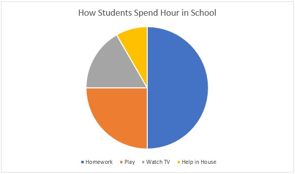
Example 3: Pie Chart
Data: How Students Spend Hour After School
Example 4: Mode, Median, Mean from Real Data
Data Set: Test Scores: 7, 8, 9, 10, 10, 12, 13
- Mode: 10 (appears twice, more than any other)
- Median: Middle value in ordered list. There are 7 values → the 4th is middle → 10
- Mean: Sum ÷ number = (7+8+9+10+10+12+13) ÷ 7 = 69 ÷ 7 = 9.857... ≈ 9.9
✅ Learners’ Activities (Expanded)
- Collecting Data Exercise
- Students survey classmates: favourite pet, number of siblings, favourite game, etc.
- Record the data in tally tables.
- Drawing Different Graphs
- Using one data set (say favourite pet), students draw: a bar graph; a pie chart; possibly a line graph if data over time (e.g. pet popularity over several months).
- Calculating Mode, Median, Mean
- Use data collected.
- Arrange data in order → find median.
- Identify most frequent value → mode.
- Add values, divide by number → mean.
- Comparing Measures with Outliers
- Give data sets with extreme values and examine how mean, median, mode behave. E.g.: 5, 6, 7, 100 → median less influenced by 100 than mean.
- Interpreting Graphs Activity
- Provide printed graphs (bar, line, pie). Ask students questions like: “Which category has the highest frequency? Which has lowest? If one category decreased/increased what would that look like?” etc.
🧮 More Assessment Checks
Use a variety of questions: oral, written, diagrams, problem‑solving.
🔸 Oral / Quick Checks
- “If 3 students choose rice, 5 choose beans, 2 choose yam, what is the mode?”
→ Beans (5) - “In data set 2, 3, 5, 5, 8, what is the median?”
→ 5 (middle value when ordered: 2,3,5,5,8) - “What is the mean of 4, 6, 8, 10?”
→ (4+6+8+10)/4 = 28/4 = 7 - Show a bar graph: “Which bar shows the largest value? How many are there?” etc.
- Show a pie chart: “Which sector is smallest? What fraction of the whole is that?”
🔸 Written Problems
- Data Set Calculation
Data: 4, 7, 7, 9, 10, 12- Mode
- Median
- Mean
- Even Number of Values Case
Data: 3, 5, 7, 9, 11, 13- Median? (average of 3rd & 4th values)
- Mode?
- Graph Interpretation
A bar graph shows number of pets: Dogs: 8, Cats: 6, Birds: 4, Fish: 2.- Which pet is most popular?
- How many more students have dogs than fish?
- If 3 more students get cats, what will be the mode?
- Pie Chart Problem
In a pie chart of 360°, one slice is 90° for “Play time”, another 45° for “Homework”, rest split equally among two other activities.- What percentage is play time?
- If total is 60 students, how many students does 90° represent?
- Mean with Outlier
Data: 10, 12, 13, 14, 100- Compute mean, median, mode
- Discuss which seems more typical and why
📝 Teacher Notes (Expanded & Detailed)
- When working with mode, median, mean, emphasize ordering data first for median.
- Highlight that mode can be categorical (non‑numeric) as well – e.g. favourite colour.
- Show how outliers (very large or very small values) can skew the mean but have little effect on median.
- Use accurate vocabulary: “frequency”, “value”, “data set”, “order”, “middle”, “average”.
- Ensure students understand difference between the three measures; often confusing mode vs mean etc.
📘 Sample Fully Labelled Diagrams
(Here are descriptions you can draw or show to students.)
- Bar Graph Diagram:
Horizontal axis labelled with categories (Apples, Bananas, Oranges, Mangoes)
Vertical axis labelled “Number of Students”
Bars of appropriate height - Line Graph Diagram:
Horizontal axis labelled “Months” (Jan, Feb, Mar, Apr, May …)
Vertical axis labelled “Rainfall in cm”
Points plotted and connected - Pie Chart Diagram:
Circle divided into sectors; each sector labelled with category and either percentage or fraction
C – Consolidation (Conclusion & Assessment)
Time: 5–10 minutes
Summary: Graphs display data, and averages (mode, median, mean) help interpret data sets.
Evaluation Method (Expanded)
Exit slip/quiz: Calculate the mean of 6, 8, 10, 12.
Assignment (Expanded)
Draw a bar graph showing the number of shoes owned by family members.
Follow-up Activity
Students collect data at home (favorite meals in family) and represent it in a table.
Differentiation / Inclusive Strategies
Use colorful graph charts for visual learners. Give step-by-step guidance for calculating mean, median, and mode.
Teacher’s Reflection (After Class)
What worked well? ___________________________________________
What needs improvement? ____________________________________
Students’ engagement level: ☑ High ☑ Medium ☑ Low