Download the Lessonotes Mobile Liberia app for faster lesson access on Android and iPhone.
Subject: Mathematics
Semester: 2
Period: 6
Week: 35
School Name:
Teacher’s Name:
Subject: Mathematics
Grade Level: Grade 5
Date: Week 35
Lesson Duration: 45 minutes
Week & Period: Week 35, Period 6
Topic: Graphs (Bar, Line, Circle, Pictographs)
Sub-topic: Constructing and interpreting different graphs
Learning Objectives
By the end of the lesson, students should be able to:
- Construct bar, line, circle, and pictographs.
- Interpret information shown in graphs.
- Use graphs to solve real-life problems.
Previous Knowledge
Students already know frequency tables.
Instructional Materials
Mathematics textbook for Grade 5, graph paper, pencils, ruler, colored markers.
Lesson Development – ABC Model
A – Anticipation (Warm-up / Starter)
Time: 5–10 minutes
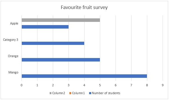
Teacher shows a bar graph of students’ favorite fruits and asks learners what information they can read from it.
B – Building Knowledge (Main Lesson Body)
Time: 25–30 minutes
Definitions & Explanations
- Bar Graph
- A bar graph uses bars (rectangles) to represent data.
- The height or length of each bar shows the frequency (number of times something occurs).
- Bars can be drawn vertically (up and down) or horizontally (side to side).
- Best for comparison between categories.
Example:
Favorite fruit survey (Class of 20):
- Mango = 8
- Orange = 5
- Banana = 4
- Apple = 3
- Line Graph
- A line graph uses points connected by straight lines to show changes over time.
- It is best for showing trends (increase or decrease).
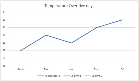
Example:
Temperature (°C) over 5 days:
- Mon = 28, Tue = 30, Wed = 29, Thu = 31, Fri = 32
- Circle Graph (Pie Chart)
- A circle is divided into sectors (slices) to represent parts of a whole.
- Each sector’s size depends on its proportion of the total.
- Useful for showing percentages or fractions.
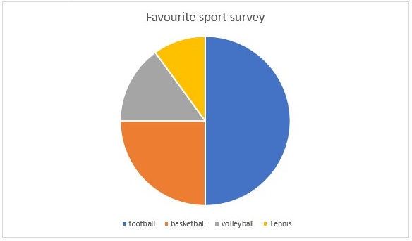
Example:
Favorite sport survey (20 students):
- Football = 10 (50%)
- Basketball = 5 (25%)
- Volleyball = 3 (15%)
- Tennis = 2 (10%)
- Pictograph
- A pictograph uses pictures or symbols to represent data.
- Each picture has a key that shows what it stands for.
Example:
Classroom pets:
- Dog = 6 🐶🐶🐶 (each 🐶 = 2 dogs)
- Cat = 4 🐱🐱 (each 🐱 = 2 cats)
- Fish = 8 🐟🐟🐟🐟 (each 🐟 = 2 fish)
Expanded Learners’ Activities
- Class Survey:
- Learners collect data on topics such as:
- Favorite color
- Favorite fruit
- Favorite sport
- Data is tallied in a frequency table.
- Graph Construction:
- Learners draw bar graphs, line graphs, pie charts, and pictographs using the same data on graph paper.
- Groups compare which graph best explains the data.
- Graph Interpretation:
- Learners interpret peers’ graphs by answering questions like:
- Which category is the most popular?
- Which shows a decrease or increase over time?
- What percentage of the class prefers mango?
Assessment Checks (Oral & Written)
- What type of graph is best for showing change in rainfall over months?
- A survey shows: Red = 10, Blue = 15, Green = 5. Which graph will best compare these?
- If a pictograph uses 🏀 = 2 students, how many students are represented by 🏀🏀🏀🏀?
- True or False: “A line graph is best for showing proportions of a whole.”
- Draw a bar graph for the data: Mango = 6, Orange = 4, Banana = 2.
Notes (Expanded & Detailed)
- Graphs present data in a simple and clear way, making it easy to see patterns, trends, and comparisons.
- Bar graphs help compare different categories.
- Line graphs show changes over time (e.g., rainfall, temperature, sales).
- Pie charts display proportions or percentages of a whole.
- Pictographs make data fun and easy to read using pictures or symbols.
- In daily life, graphs are used in newspapers, weather reports, business sales, sports statistics, and school results.
C – Consolidation (Conclusion & Assessment)
Time: 5–10 minutes
Summary: Teacher revises types of graphs and their uses.
Evaluation Method (Expanded):
Exit slip/quiz: Learners draw a bar graph of students’ favorite drinks.
Assignment (Expanded):
Collect data at home (e.g., number of hours spent on TV, chores, or games). Represent it using a line graph.
Follow-up Activity:
Learners bring examples of graphs from newspapers or magazines.
Differentiation / Inclusive Strategies
Provide pre-drawn axes for weaker learners. Allow use of symbols in place of drawing for pictographs.
Teacher’s Reflection (After Class)
What worked well? ___________________________________________
What needs improvement? ____________________________________
Students’ engagement level: ☑ High ☐ Medium ☐ Low